Decomposing Time Series Data

Decomposing Time Series Data

When we have time series data we may want to decompose it into component parts.  Python makes this easy with the Statsmodel library’s function, seasonal_decompose().  We are going to assume a multiplicative relationship between the data.  Let’s use it:

import statsmodels.api as sm
res = sm.tsa.seasonal_decompose(ts.values, freq=12, model="multiplicative")
fig=res.plot()

This returns the following graphs:

Screenshot 2019-02-17 at 12.42.56 PM

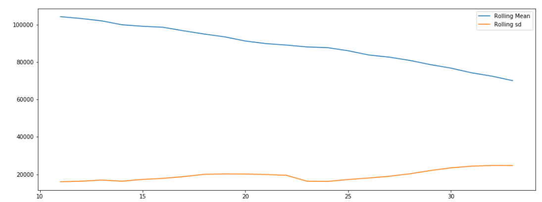
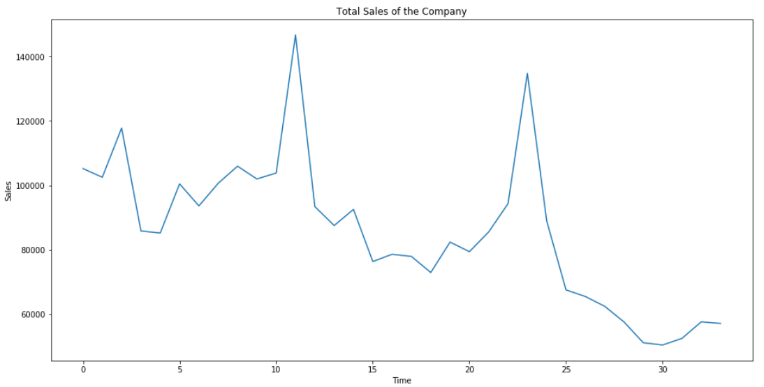
We can see that the series is trending down and has a strong seasonal component to it. After the trend and seasonality is removed we are left with the residual data which doesn’t seem to exhibit and strong patterns.

Rolling Mean and Standard Deviation of Time Series Data

Rolling Mean and Standard Deviation of Time Series Data

This week let’s try and graph the rolling mean and standard deviation of the data set.  Let’s see how it changes over time.

plt.figure(figsize=(16,6))
plt.plot(ts.rolling(window=12, center=False).mean(), label="Rolling Mean")
plt.plot(ts.rolling(window=12, center=False).std(),label="Rolling sd")
plt.legend()

This returns the following graph:

Screenshot 2019-02-10 at 3.44.41 PM

As we can see, the mean is trending down while the standard deviation seems to be going up slightly.

Graphing Time Series Data

This week let’s graph the time series data.  In order to do that we are going to have to put the time values in buckets.

ts=sales.groupby(["date_block_num"])['item_cnt_day'].sum()
ts.astype("float")
plt.figure(figsize=(16,8))
plt.title("Total Sales of the Company")
plt.xlabel('Time')
plt.ylabel("Sales")
plt.plot(ts)

This will return:

Screenshot 2019-02-03 at 5.00.27 PM

Now we can see the total sales through time.  We still don’t have them grouped by dates on the x axis, just by relative time.  We will continue next week.

Graphing Time Series Data

Graphing Time Series Data

This week let’s try and group the data into the correct time frames and get it to graph correctly.  As I said last week some of the code is taken from the top kernel in Kaggle.  Let’s get started:

sales.date=sales.date.apply(lambda x:datetime.datetime.strptime(x, '%d.%m.%Y'))
monthly_sales=sales.groupby(["date_block_num", "shop_id", "item_id"]) ["date", "item_price", "item_cnt_day"].agg({"date": ["min", "max"], "item_price":"mean", "item_cnt_day":"sum"})

Now let’s make a histogram:

x=items.groupby(['item_category_id']).count()
x=x.sort_values(by='item_id', ascending=False)
x=x.iloc[0:10].reset_index()
plt.figure(figsize=(8,4))
ax=sns.barplot(x.item_category_id, x.item_id, alpha=.8)
plt.title("Items per Category")
plt.ylabel("# of items", fontsize=12)
plt.xlabel("Category", fontsize=12)
plt.show()

Which shows:

screenshot 2019-01-27 at 5.59.12 pm

We’ll continue next week.